G'Day Out
Harnessing the power of Generative AI to curate itineraries and travel recommendations.
Timeline
G'Day Out
Harnessing the power of Generative AI to curate itineraries and travel recommendations.
G'Day Out
G'Day Out
Harnessing the power of Generative AI to curate itineraries and travel recommendations.
Role
UX/UI Designer, Market Researcher, UX Researcher
Three months - 24 hours per week
Tools Used
Figma & Miro
Role
UX/UI Designer, Market Researher, UX Researcher
Timeline
Three months - 24 hours per week
Tools Used
Figma & Miro
Role
UX/UI Designer, Market Researcher, UX Researcher
Timeline
Three months - 24 hours per week
Figma & Miro
Tools Used


Background
Background
Background
This was a capstone project for the Interaction Design course, where I was in a group of four other designers to design a minimum viable product (MVP) that combines Generative AI with user-centric design.
This was a capstone project for the Interaction Design course, where I was in a group of four other designers to design a minimum viable product (MVP) that combines Generative AI with user-centric design.
This was a capstone project for the Interaction Design course, where I was in a group of four other designers to design a minimum viable product (MVP) that combines Generative AI with user-centric design.
Problem
Problem
Problem
Although the ease of restrictions after the COVID-19 pandemic has brought back a sense of normality in society, many young adults aged 18-25 are experiencing an increased level of loneliness and are threatened with the cost-of-living crisis. As a result, this has hindered their catch ups with loved ones.
Although the ease of restrictions after the COVID-19 pandemic has brought back a sense of normality in society, many young adults aged 18-25 are experiencing an increased level of loneliness and are threatened with the cost-of-living crisis. As a result, this has hindered their catch ups with loved ones.
Although the ease of restrictions after the COVID-19 pandemic has brought back a sense of normality in society, many young adults aged 18-25 are experiencing an increased level of loneliness and are threatened with the cost-of-living crisis. As a result, this has hindered their catch ups with loved ones.
Goal
Goal
Goal
To design a solution that curates itineraries based on the user’s budget and preferences. G’Day Out’s intention is to empower young people to explore their surroundings while strengthening social bonds within the means of their budget.
To design a solution that curates itineraries based on the user’s budget and preferences. G’Day Out’s intention is to empower young people to explore their surroundings while strengthening social bonds within the means of their budget.
To design a solution that curates itineraries based on the user’s budget and preferences. G’Day Out’s intention is to empower young people to explore their surroundings while strengthening social bonds within the means of their budget.
The Process
The Process
Adopting the Lean UX framework to develop an MVP within a short time-frame of three months.
Adopting the Lean UX framework to develop an MVP within a short time-frame of three months.
Think
Think
Think
Understanding the problem | Gathering Market insights | Developing empathy
Understanding the problem | Gathering Market insights | Developing empathy
Understanding the problem | Gathering Market insights | Developing empathy
Make
Make
Make
Lo-Fi prototype | Mid-Fi prototype | Hi-Fi prototype
Lo-Fi prototype | Mid-Fi prototype | Hi-Fi prototype
Lo-Fi prototype | Mid-Fi prototype | Hi-Fi prototype
Test
Test
Test
User interviews | Usability testing | Gathering feedback
User interviews | Usability testing | Gathering feedback
User interviews | Usability testing | Gathering feedback
Repeat
Repeat
Repeat
Continuous iteration after receiving feedback on the prototype
Continuous iteration after receiving feedback on the prototype
Continuous iteration after receiving feedback on the prototype
Think
Think
Understanding the problem, gathering market insights & developing assumptions.
Understanding the problem, gathering market insights & developing assumptions.
Understanding the problem, gathering market insights & developing assumptions.
Upon being briefed on the project, I conducted desk research to explore implementing Generative AI in our design solution, drawing from my experience with tools like ChatGPT. I focused on how users could use AI for trip planning while being mindful of ethical concerns and the potential for inaccuracies that could harm user experience.
Additionally, I researched post-lockdown social experiences among young adults (18-30). This approach, aligned with Lean UX methodology, laid a solid foundation for our user assumptions, guiding the design process effectively. The insights gained helped us formulate hypotheses for the Lean UX Canvas to test during usability sessions.
Working in a small, cross-functional team allowed us to delegate tasks based on our strengths, enhancing efficiency and quality. With my marketing background, I analysed direct and indirect competitors through a design audit to identify market gaps that G'Day Out could benefit from.


Make
Make
Lo-fi, mid-fi prototype & feedback
Lo-fi, mid-fi prototype & feedback
Each team member was assigned a section of the app to design wireframes. Based on our initial assumptions, I created the lo-fi wireframes for the matching section, where users input their preferences like time, activity, location, and budget. Designing the lo-fi prototype was challenging due to missing information, but it served as a solid foundation for our envisioned MVP.
After collaborating and brainstorming wireframe ideas, one group member developed our mid-fi prototype.
I also created a user flow diagram, user stories, and an information architecture diagram to guide the design process during the 'make' phase. While these elements are part of the Agile process, their inclusion helped align our designs with user needs. However, validating the user flow and stories with G'Day Out's target users would have been beneficial, as these diagrams were based on our assumptions.
The mid-fi prototype underwent several feedback sessions with other UX designers, which were crucial for refining our designs and achieving a minimum viable product (MVP).


Make (Iterate)
Make (Iterate)
Hi-fi Prototype
Hi-fi Prototype
Hi-fi Prototype
To gather insightful data and validate our design, I interviewed five users aged 18-30 and conducted usability tests with an additional five users from the same group. I used a structured approach, starting with close-ended questions to establish rapport before transitioning to open-ended questions about their experiences with organising social gatherings. This allowed for deeper exploration of their behaviours and reasoning, which was valuable for refining the MVP.
Conducting heuristic evaluations with our users was crucial, as our wireframes were based on assumptions in line with Lean UX methodology. The results were categorised by severity, with recommendations for improving usability.
Findings:
The gamification aspect (swiping on recommendations) was appealing.
The app's colour scheme and appearance were unappealing to our target audience.
Users requested more preferences and the ability to search for options.
4 out of 5 participants preferred places recommended by family, friends, or social media.
All participants indicated that price, location, type of activity, and company influence their choices.
The mid-fi prototype lacked personality and colour, appearing less modern than other travel apps.
Based on these findings, I redesigned the prototype to achieve the MVP by updating the colour palette to align with G'Day Out's branding, changing the typography to the modern 'Be Vietnam Pro' font, and adding emojis to enhance appeal for our target audience.


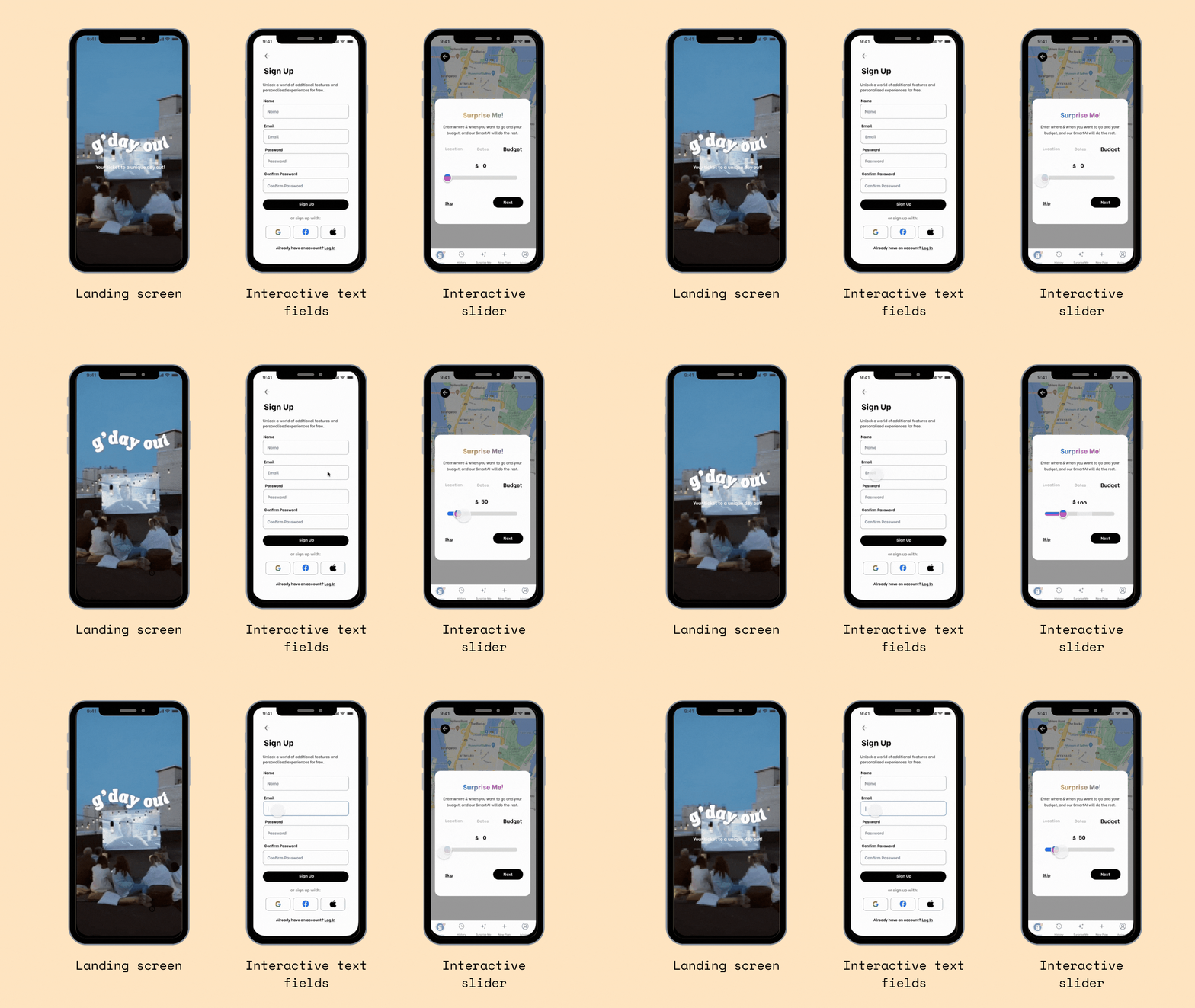
Although I was happy with the redesign, I felt something needed to elevate the prototype. I decided to add animations and responsive components to the design to replicate the user’s interactions.
This was achieved by:
Adding animations to the text on the launch screen of the app.
Highlighting the main functionality of our app, the “Surprise Me!” feature, by adding a gradient effect to text that changes colours sequentially – this is to entice the user to click on the button.
Creating interactive sliders and text fields.


Reflection
Reflection
Next steps & key takeaways
Next steps & key takeaways
Next steps & key takeaways
Combining primary and secondary research during the discovery phase of a UX/UI project is essential for refining design and ensuring that the components created are genuinely useful for users, thus avoiding waste.
Develop interactions for other features of the app (notes, photo feed & time selector).
Continue to test and iterate prototype after each improvement to the prototype, making sure that different users are recruited for each test to avoid potential bias.
Plantivity
Redesigned an existing e-commerce website to improve the user experience and increase sales, including a streamlined checkout process and improved navigation.


View case study
Plantivity
A user-centric app that tracks the productivity levels of the user with a real plant.
View case study


